This will give you a brief introduction to the “Character” window and the various parts you can change to help customize the look of your type.
Step 1:
Go to the Apple Menu > Window > Type > Character
Notice the keyboard shortcut next to “Character,” command “T.” Learning these shortcuts will allow you to work more quickly.
This should reveal the “Character” window in your Illustrator workspace.

Within the “Character” window we can change numerous aspects that will change the look of our typography in Illustrator: font family, font style, size, kerning, leading, and tracking.

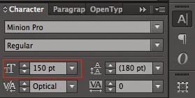

The first two items in the “Character” window are the font family and font style. Seen above to be set as Minion Pro and Regular.
Below these two fields on the left, top is the type size, indicated above as the field set to 150 pt (we always want this set to a whole number). Just below the type size is the kerning, seen above set to “Optical.” We always want to set our default kerning to the optical setting.
On the right below the fields for font family and font style, we will find settings for “Leading” (top) and “Tracking” (bottom). For this demo we will leave these on the default settings, which can be seen in the above pictures.
Step 2: Changing the font family.
In your “Character” window, select the arrow next to the top most field. This will bring up a list of all the fonts that are installed on your computer. Scroll through and select the font family you wish to use. If there is an arrow next to the font family, it means that there are different styles that you must select from, a sample is shown below.

In this instance, I am selecting Minion Pro and then will select the style that I want to use; Regular.
No comments:
Post a Comment