Open your photos in Photoshop\
Remember to save your file often. You cannot save your file too much
Creating a New Document
Step 1: Go to the Apple Menu > File > New… to create a new document with the correct dimensions for the project.
A new window will prompt you to set your dimensions for your file and pixel resolution. Set them to match this photo…
Click “OK”
Removing the Background on an Image
Step 1: Go to the image you want to remove the background from and go to your “Layers” tab. Click the icon on the far right of that tab  and select “Duplicate Layer”.
Name the layer…
Step 2: With the new layer selected, Select the “Paths” tab and from the same pull down menu create a New Path…
Name the Path…
Step 3: With the new path selected, go to your Toolbar on the left and select the Pen Tool…
 , Zoom in and begin to create your Path, outlining the image carefully. To use the Pen Tool remember to click and drag the “handles” in the direction that you are outline (if your next point will be created above the previous point, click and pull up; to the left, click and pull to left).
Continue around your image, closing your path so that you create a complete shape. If this icon  does not appear at the end when trying to close your path go back through and double check to make sure that your path is continuous and fix as needed.
A closed path…
Step 4: Next, with your path selected Click on the third icon from the left at the bottom of the Paths tab to select your path (make marching ants).
Your image selected…
At this point make sure you uncheck the “Eyeball” (seen above) that sit next to the Background Layer.
Step 5: Now you are all set to add a layer mask. To do so, click the third icon from the left at the bottom of the “Layers” tab. Seen below…
Once you click this icon your image should change to look like this…
You have successfully removed the image background, now to make it look less “mechanical”.
Refining the Layer Mask
Step 1: With the layer mask selected, go to the Apple Menu > Select > Refine Mask…
Step 2: Upon selecting this it will prompt you with a window where you can make various adjustments. As you can see I chose to only adjust the “Feather” and “Smooth” areas. When you have adjusted the “look” of the layer mask to your liking click “OK”.
Step 3: You have successfully removed the background and altered your layer mask so the edges look more natural. Your last step is to save the file. Go to the Apple Menu > File > Save As… when the window prompts you remember to select the triangle next to the file name to better see where you are saving your file. Make sure you save this file as a PSD format so you may edit it if needed at a later time.
Moving one image layer into a new document
Step 1: Click on the tab (in the main Photoshop window) of the image you want to combine with your new canvas and drag it away from the tabbed bar so it creates a new window, and release.
Your document will look like the image below once this step is complete.
Step 2: Switch to your document you created for this project and keep the new window in the foreground. As also seen in the image above click on the layer you want to move into the new document and drag it to the window of the 10 x 8 inch document. Make sure that both the image and its layer mask is being “copied”.
Moving an unedited image to a new document
Step 1: Go to the image you want to move into your project document. Go to the Apple Menu > Select > All to select the entire image area.
Step 2: Next go to the Apple Menu > Edit > Copy to copy the selected area.
Step 3: Move to your project document and go to the Apple Menu > Edit > Paste to paste the newly copied image into that document.
Once pasted your file will now look like this… and you will need to reorder your layers to see your other image.
Step 4: To reorder your layers, select the the layer you want to move and drag it into the order you want, as seen in the image above. After reordering your photos your screen will look something like this.
Transforming a Photo
Step 1: With the layer selected that you wish to transform, go to the Apple Menu > Edit > Free Transform as seen below…
Step 2: Next make sure that you click the “link” between the height and width to ensure that you will be scaling your image proportionally. The icon is highlighted in image below.
Step 3: Now that we have everything set up for proper scaling, we need to zoom out so that we see the edges of the image we are scaling (or we see the handles on the image). To zoom out hit command plus the dash symbol (the key to the right of the zero on your keyboard). Zoom out until your screen looks similar to the what is below.
Step 4: Grabbing one of the corners scale your image to whichever size you would like and position it on the canvas.
When satisfied with the positioning and size, double click within the frame of the picture to finalize the transformation.
Altering the color of a photo - One method
Step 1: Zoom into the area of the photo which you want to alter and go to and click on your “Paths” tab. Once here select this icon  and select “New Path…” seen below.
When prompted name your new path.
Step 2: Next use the Pen Tool to create a path that outlines the portion of your image that you want to adjust the color or apply another effect. In the case of this demo, it will be the eyes.
Step 3: Once you have completed your path, you will need to turn your path into a selection. To do this click the third icon from the left at the bottom of the “Paths” tab to convert your path into a selection (marching ants). Highlighted in the image below.
Step 4: With the layer that contains the image that you would like to adjust the color selected, click on this icon  and select “New Layer…” seen below. Through out these next steps make sure that this new layer is always selected.
When the window prompt comes up, name your layer. In this case I will call it “Eyes Color”.
Step 5: Next we will want to choose the color that we want our selection to become. To do this go to the bottom of the toolbar on the left hand side of the screen and click the foreground color.
When the “Color Picker” window appears, select the color that you would like to use and click “OK”, seen above. This will set your foreground color.
Step 6: Next we will want to switch the foreground and background colors. This can be done in two ways: 1) by pressing “X” on your keyboard, or 2) by click the two arrows highlighted in this image of the toolbar…
Step 7: Once you have swapped the foreground color to the background color you will need to hit “command plus delete” to fill your selection with the background color. Resulting in an screen that may look something like this.
Step 8: You will now need to deselect (remove the marching ants) the eyes. To do this go to the Apple Menu > Select > Deselect as seen below…
Step 9: In the “Layers” tab choose the drop down menu that states “Normal”, this is your layer style. Change your layer style from “Normal” to multiply. You can also adjust the Layer’s opacity if you wish to get the exact look you would like. Feel free to play with the different layer styles to get the effect that you like and will work with your image.
Adding an Adjustment Layer
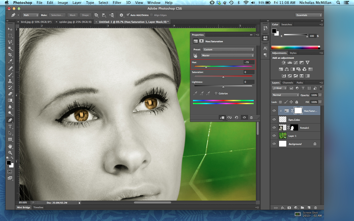
Step 1: With the latest layer you created, in my case “Eyes Color”, selected move to the bottom of the Layers tab and select the fourth icon from the left to choose an adjustment layer, which will allow you change the properties of all the images, or in this case just one layer. For the purpose of this demo, I will be choosing “Hue/Saturation”.
This action creates a new layer, which if not nested to one layer will affect the entire image you are creating. To nest the adjustment layer to another layer, hold down the option key and click between the two layers (a symbol that looks like a square with a double ended 90 degree arrow in the lower left hand corner will appear right before you click). Once nested the layer should look like the image below.
Step 2: With this new layer selected, you can now adjust the properties of the adjustment layer. In this case we have the option to adjust the Hue, Saturation, and Lightness. Different adjustment layers have different properties that you can adjust. Again play with the different type of adjustment layers available to determine what might work best.
When you are all done just close the Properties window and Save your document.


